


Hey guys, In this article, we are going to look at how to create an interactive data visualization map using Kepler gl. In today's world Data is everything and everywhere, the way we see it is constantly evolving over the years. Visualizing maps is one of the important applications in the data visualization branch. Here we can see how to get started with it.
What is Geospatial Visualization?
Geospatial data visualization is a constructive practice that integrates interactive visualization into traditional maps, allowing the ability to explore different layers of a map, zoom in and out, change the visual appearance of the map, and relate a variety of factors to the geographic area.
Geospatial modeling uses advanced cartographic technologies allowing analysts to visualize geospatial data, spanning industries such as urban planning, transportation, and investment management.
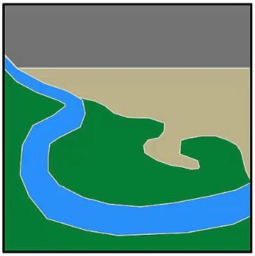
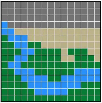
Data is an important part of Geo-visualization. The two main types of geospatial data are vector data and raster data.
Vector Data:
Uses geometric shapes to show the location and shape of geographic features. Points, lines, and polygons can represent things like cities, roads, and waterways. Vector data is scalable, has small file sizes, and is ideal for depicting boundaries.
Raster Data:
Represents data through a digital image such as a scanned map or photograph. It also includes aerial and satellite imagery. Raster data uses a cell-based format called stair-stepping to record data as pixels or grids with an image. The spatial analysis depends heavily on raster datasets.
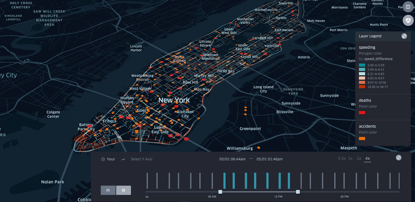
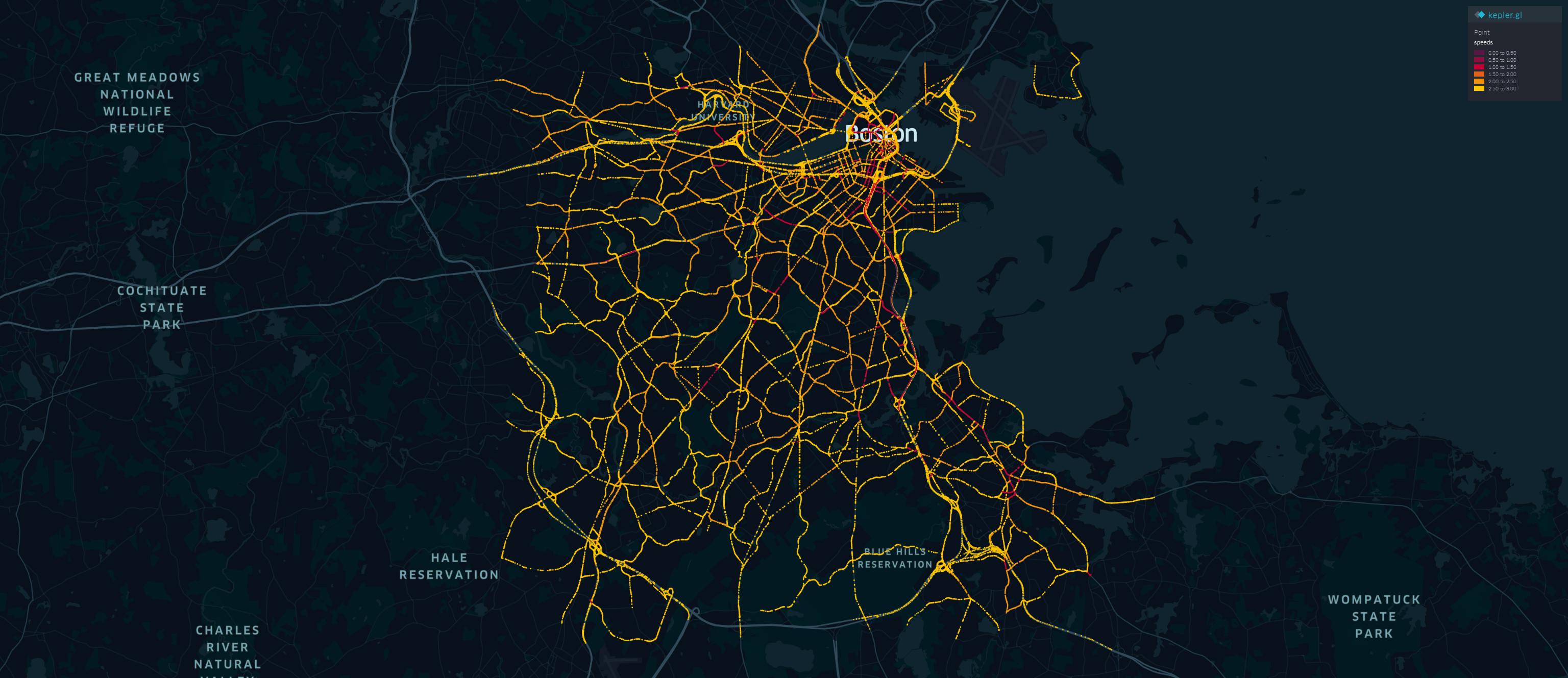
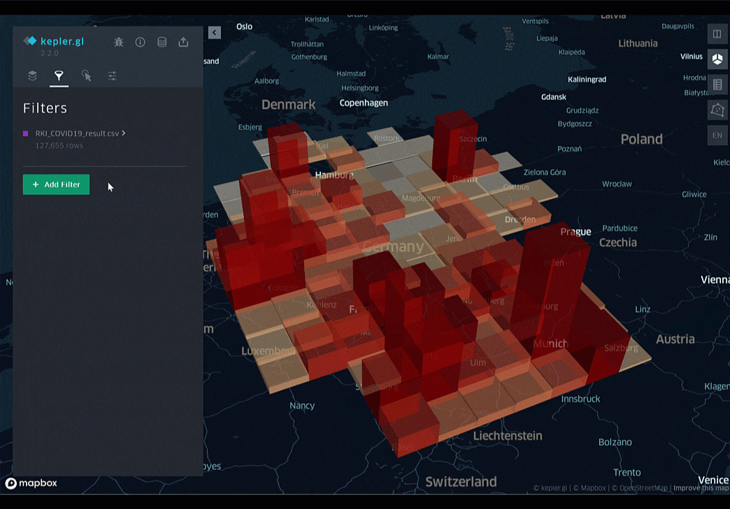
To make Geospatial visualization easier with a variety of experiences and to create meaningful data visualizations, we use Kepler. gl, an open-source geo-analytics tool. Built on top of the deck.gl WebGL data visualization framework, Kepler. gl scales the map creation process by quickly gaining insights and validating visualization ideas from geospatial data.
Intro to Kepler gl
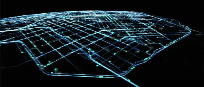
Kepler. gl is a data-agnostic, high-performance web-based application for the visual exploration of large-scale geolocation data sets. Built on top of the deck.gl, Kepler. gl can render millions of points representing thousands of trips and perform spatial aggregations on the fly.
 Kepler. gl uses layers as building blocks to create interactive maps, supporting customizable layer creation and encoding data to visual channels with scale functions.
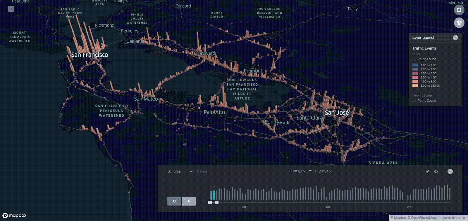
To take an example to show, we can Visualize traffic data.
 we can get data set for traffic from HERE. sign in for a free account -> search for the traffic data -> get the API key. once you have done it, you are ready to go.
enough of reading -> Lets code 👨💻
before it, you should have installed the required dependencies.
from matplotlib import pyplot as plt
import numpy as np
import matplotlib.cm as cm
import requests
from bs4 import BeautifulSoup
import xml.etree.ElementTree as ET
from xml.etree.ElementTree import XML, fromstring, tostring
import pandas as pd

API_KEY='YOUR_API_KEY'

page = requests.get('https://traffic.api.here.com/traffic/6.2/flow.xml?app_id='+API_KEY+'&bbox=42.37,-71.20;42.22, -70.98&responseattributes=sh,fc')
file = open('speeds.txt', "w")
file.write(page.text)
file.close()

soup = BeautifulSoup(open('speeds.txt'))
roads = soup.find_all('fi')

a1=[]
loc_list_hv=[]
lats=[]
longs=[]
sus=[]
ffs=[]
c=0
for road in roads:
    //for j in range(0,len(shps)):
    myxml = fromstring(str(road))
    fc=5
    for child in myxml:
        //print(child.tag, child.attrib)
        if('fc' in child.attrib):
            fc=int(child.attrib['fc'])
        if('cn' in child.attrib):
            cn=float(child.attrib['cn'])
        if('su' in child.attrib):
            su=float(child.attrib['su'])
        if('ff' in child.attrib):
            ff=float(child.attrib['ff'])
    if((fc<=10) and (cn>=0.7)):
        shps=road.find_all("shp")
        for j in range(0,len(shps)):
            latlong=shps[j].text.replace(',',' ').split()
            #loc_list=[]
            la=[]
            lo=[]
            su1=[]
            ff1=[]

            for i in range(0,int(len(latlong)/2)):
                loc_list_hv.append([float(latlong[2*i]),float(latlong[2*i+1]),float(su),float(ff)])
                la.append(float(latlong[2*i]))
                lo.append(float(latlong[2*i+1]))
                su1.append(float(su))
                ff1.append(float(ff))
            lats.append(la)
            longs.append(lo)
            sus.append(np.mean(su1))
            ffs.append(np.mean(ff1))
Kepler. gl likes files to be saved as CSV, with distinct columns. If you want an instantaneous geospatial plot, you need to label the columns as ‘latitude’ and ‘longitude,’ for spatial locations, and a third column for the color palette (which is the speed in the case of traffic information).
lats_r=[]
longs_r=[]
speeds_r=[]
for i in range(0,len(lats)):
    for j in range(len(lats[i])):
        lats_r.append(lats[i][j])
        longs_r.append(longs[i][j])
        speeds_r.append(sus[i]/ffs[i])
    print(i,len(lats))

data_bos=np.array([lats_r,longs_r,speeds_r])
df=pd.DataFrame(data=data_bos[:,1:].T,columns=["latitude", "longitude","speeds"])


speed2=np.array(df['speeds'])
w=np.where(df['speeds']<0.25)
speed2[w]=0
w=np.where((df['speeds']<0.5) & (df['speeds']>0.25))
speed2[w]=1
w=np.where((df['speeds']<0.75) & (df['speeds']>0.5))
speed2[w]=2
w=np.where(df['speeds']>0.75)
speed2[w]=3

df['speeds']=speed2
df.to_csv('df_speeds.csv')
Kepler gl web
we also can use the web version of Kepler. gl, which is handy and customizable.
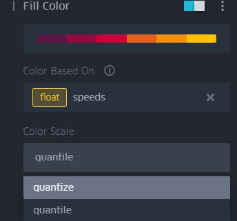
 There is a color scale that we can customize according to our wishes and requirement. For example, if most of the traffic is fast-moving, the color palate will be skewed towards these higher speeds. However, this is not what we want. We want colors to clearly indicate absolute speeds: just like in Google Maps traffic. In this case, we choose colors based on quantized value, rather than quantile, as below.
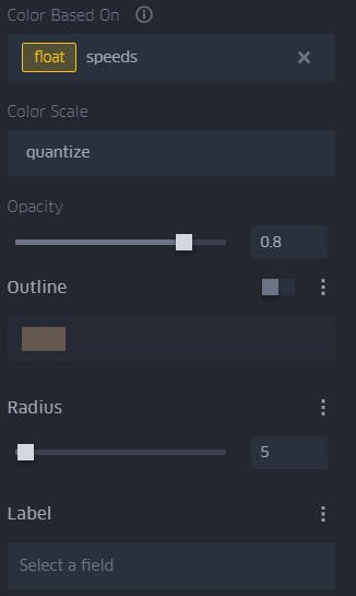
we can also customize the symbols on how should be looked for beautiful visualization.
 To use Kepler gl web is pretty much easy and self-explanatory. if you use it quite a few times, you will be comfortable with it. But using Kepler gl in their web has quite a few creative drawbacks in my view.
outro
I hope you got a basic understanding of what is Kepler gl and how to use it.
Kepler. gl is great for generating elegant visualizations with minimal effort, relatively quickly. Plotting hundreds of thousands of points on my local machine using OSMnx and other Python libraries takes much longer in comparison.
You can come up with your own visualization and ideas using Kepler. gl. Your imagination is your limit. Try it and explore it, it is gonna change how we visualize data.
related sources:
Thank you for reading😊
HAPPY LEARNING
-JHA